


2.2 Growth Strategy — reading the band grid
The result is a grid of sixteen bands, from Top Revenue with High Margin down to Low Activity with Nil Margin. Each cell shows how many records sit in that band now, and how that count has changed since the earlier period. Beneath the grid, a Lost row counts records that were trading before and are not trading now.
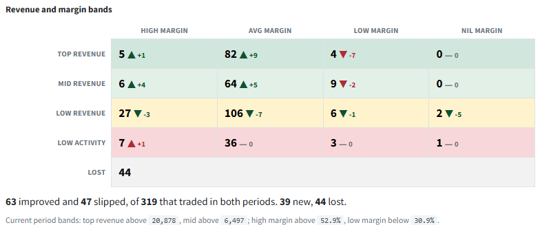
An up arrow is not always good news
In the top bands, more records is growth. In the bottom bands, more records means more of your base has slipped — so the colour follows what the change means, not which way the arrow points.
The band limits come from your own data
Revenue cut-offs are where the running total passes 80% and 95% of the period's sales; margin bands sit one standard deviation either side of the average. They are recalculated every run, and each band states its limits when you open it.